|

|
|
|
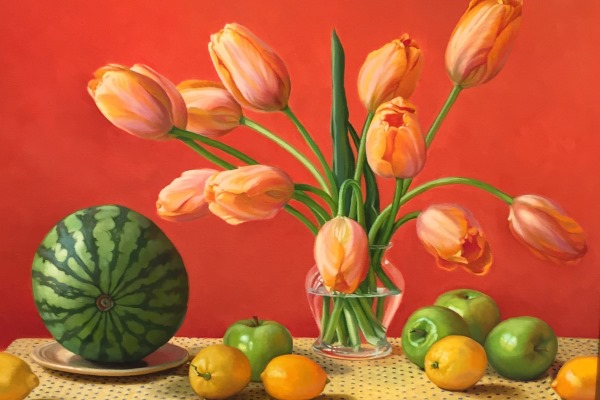
Kay Ritter, TULIPS AND WATERMELON, oil on linen, 20 x 24 inches (25.5 x 29.5 framed), $5,500
Last year, Kay Ritter was about to paint one of her quirky narrative pieces when the owner of her previous gallery asked if she’d mind doing something more traditional. Ritter agreed, thinking she’d enjoy painting some flowers; and she began by setting up a still life with a vase of tulips and a watermelon, along with some apples and lemons. “I kept rearranging until I got something that lit me up and made me want to paint it,” she says. But by the time she was done, “Tulips and Watermelon” was about as nontraditional as a highly realistic floral still life can be.
More than anything else, the painting became — for her — about the bold and unexpected color harmony: the orange, the green and the yellow. The top two-thirds of the painting is basically orange, the bottom third essentially yellow. Green occupies a middle ground, infiltrating above and below to unify the composition. “It wasn’t like I set out to make a painting about this, but it’s sort of an organic process,” Ritter says. “I can’t channel anyone else’s desires into what I’m painting because it doesn’t work.”
She keeps a large assortment of potential backdrops on hand. In this case, the one that worked when she placed it behind the arrangement was a large piece of salmon-colored Canson drawing paper. “I didn’t expect it to,” she says. “I was flipping through background colors and waiting for the moment.”
The quirkiest thing about the painting, though, is undoubtedly the watermelon. In making the unusual decision to position it so that it makes an almost perfect circle, Ritter draws our attention to the striking pattern of the alternating light and dark green stripes. In addition, she felt the big fruit’s “pose,” if you will, “anthropomorphized the watermelon” to some extent, giving the node the suggestion of an eye. “I like to think of objects as creatures of some sort,” she says. “I think making the watermelon facing towards you gives him a little more personality.”
|
|
|
|
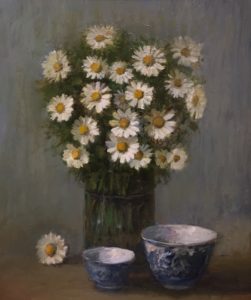
Loves me … loves me not … loves me … It’s clear just from looking at “Daisies with Antique Bowls” that the artist loves and treasures the simple objects in this still life. “I’ve painted daisies all through my life,” says Osterville artist Susan O’Brien McLean. “The little blue-and-white bowl — I’ve painted it so many times. I got it at an antique market in England.”
Because of her husband’s job, Susie lived in South Africa through much of the 1970s and then in England for 12 years. She went to Wimbledon and the Ascot races and generally immersed herself in the gracious lifestyle of another era. Perhaps because her mother — an Anglophile before her — had china in the blue Willow pattern, Susie began collecting blue-and-white pottery in England. The two little bowls in the painting were relatively inexpensive — probably early 20th-century imitations of late 18th-century antiques. The larger of the two is a teacup. (Teacups were initially handle-less — like those in China — when tea first became popular in England, Susie notes.) “There’s nothing nicer than having tea in a blue-and-white teacup,” she says (while admitting she generally uses a mug these days). “The first painting I ever did in England in the ’80s was all blue-and-white pottery.”
In this still life, she beautifully captured the bowls’ delicacy and luster along with the daisies’ cheery freshness. The challenge, of course, is that daisies don’t last long — and Susie does prefer painting them from life. When her favorite field daisies are in bloom, she drives around with scissors and a vase of water in a box. “I like the small ones you see by the side of the road,” she says. This particular piece was painted over the course of two years because — after her first bunch of daisies faded — she didn’t have time to pick replacements until the following summer.

When Odin Smith paints water — as she does often — it’s usually some aspect of the coastline along her native Cape Cod. With “Shallow Rivers,” however, the scene is in Woodstock, New Hampshire, an idyllic spot right off the main street in the center of town where two rivers flow together. “It was an emerald green,” she says. “It’s very transparent water; you can see right down to the bottom. It looks like three feet but it could be 12 feet.”
Odin based “Shallow Rivers” on a photo she took of her children playing on the rocks during a early fall vacation in the White Mountains, but the children “didn’t make the cut,” she says. That’s only typical, though. She seldom includes figures in her landscapes because they usually don’t contribute to the peaceful mood she’s after.
While the market for New Hampshire landscapes is not particularly strong on Cape Cod, Odin couldn’t resist painting the scene for her own enjoyment. “We don’t have a lot of rocky environments on the Cape,” she says. “Any time you move away from what you’re familiar with, it’s challenging.”
As a longtime art instructor, Odin knows from experience that — when it comes to painting — “there’s no one way to get the job done.” Her own approach changes from painting to painting, but is never what you might call methodical. “I like to jump in and make changes as I go,” she says. “I’ve already done a lot of planning in my head before I execute it. I like to jump in while I’m really feeling inspired.” View more paintings by Odin Smith

William R. Davis has built his highly successful career around emulating the styles and techniques of 19th-century American marine and landscape artists while following his own vision: It’s almost as if he were of their time and mentality.
Essentially a self-taught artist, Bill initially mastered the approach used by such Luminists as Martin Johnson Heade and Fitz Hugh Lane. (“Luminism” denotes a style of painting characterized by crystalline light, attention to detail and a satin-smooth surface devoid of obvious brushstrokes.) A few years ago, however, he began moving in a somewhat different direction, looking back to the Tonalist style popular with American artists from the 1880s until about 1915. George Inness, James MacNeill Whistler and Dwight Tryon are among the artists associated with this approach, derived from the French Barbizon school and defined by a pervasive atmospheric color and distinctive mood.
Bill first paints his skies and lets them dry. The actual subject matter comes later — as it did with “Day’s End,” a sunset in the hazy heat of summer. “It could have been a yachting scene, but that day I got up and decided I was going to paint trees,” he says. The sky’s orange glow suffuses the whole scene as if the very air were bathed in dusky color. The idea for the steak of light piercing the sky came from a painting by John J. Enneking, a Boston artist who sold a great many sunsets in his time.
While Bill seeks to paint works resembling 19th-century landscapes in look and feeling, he never copies work. Nor does he generally paint actual locations. “Almost all my paintings are made up,” he says. “I like to paint something that’s almost surreal, like a moment in time. I like paintings that make me feel like they suddenly put you someplace.”
The dilapidated rail fence certainly helps establish a strong sense of place in “Day’s End.” “I love old fences,” Bill says. He compares them to the crumbling ruins — such as castles, towers and statues — in many romantic 19th-century landscapes. “It makes you understand someone used to live there.”
Bill also frequently includes crows in his paintings. “It’s like a second signature, I use it so often,” he says. Although each of the birds here is defined merely by two expert flicks of the brush, the V-shaped marks suggest a living presence within the scene. Maybe we imagine a haunting caw or two breaking the evening’s silence. Or maybe — as we “watch” the crows circling overhead — our spirits soar a bit, too. View more paintings by William R. Davis

While on a trip to Ireland with his family last year, Cotuit artist Jason Eldredge found time to sit and sketch at an outdoor cafe on a corner in Galway. With an abundance of street performers, somewhat cock-eyed architecture and Irish flags flying, the downtown area felt festive. “The place reminded me a bit of Provincetown,” he says.
In “Galway, Ireland,” many of the sights he saw create a kaleidoscope of memories. Jason calls it an “emotional composite,” because, for him, conveying the impact of an experience is more important than realism. For example, a few rivers do run through Galway, but not in the streets, as the painting might suggest. However, the device of flowing water unifies the elements and creates a feeling of movement throughout the painting.
At left, a musician sits on a bench, playing his guitar between bronze statues of Oscar Wilde and Estonian writer Eduard Vilde, just as he was when Jason saw him. The artist and his daughter Cassidy tipped many of the performers. That’s her in the yellow slicker she wore throughout the trip, putting some coins in a guitar case. The hexagonal stones she’s stepping on were inspired by the Giant’s Causeway, a natural wonder in Northern Ireland. “They aren’t actually in Galway, but it seemed like a good way to get her up above the water,” Jason says.
Cassidy also made friends with the dog — though he was in front of a shop rather than in a boat. No matter. “The border collie/sheepdog is sort of ubiquitous in Ireland,” Jason says. So, of course, are pubs, like the checkerboard building on the corner. Another key aspect of the painting is the row of houses along the harbor in the background. They weren’t visible from where Jason was sketching, but — as “the most photographed street in Ireland” — they certainly help identify the scene. See more paintings by Jason Eldredge
P.S. HAPPY ST. PATRICK’S DAY!

Like most of Cummaquid artist Peter Coes’ paintings, “She Lit a Candle at Twilight” suggests a story without really spelling it out. Although there’s no person in this autumn scene, we sense the house is occupied, lived in. There’s a bicycle (one of the artist’s trademark subjects) leaning casually against the house. There’s a garden hose coiled on the grass as if someone’s been watering the lawn. The downstairs windows are open, a further clue the day has been warm. And, as alluded to by the enigmatic title, there’s a single candle burning in the upstairs window. Like almost all his figures, this unseen protagonist is — in the artist’s mind — a woman. “I’m sure she hoped that someone would see the candle and be welcomed by it,” Peter says.
At far left, placid waves leave their eyelet pattern of foam on the sand. The setting is presumably Cape Cod, but the house is a transplant. Peter, who grew up in the small town of Longmeadow, Mass., used to pass the house on the way to his future wife’s parents’ home in nearby Springfield. “The house isn’t on Cape Cod, but it always looked to me like it should be by the ocean,” he says. “Where it was seemed totally out of place.” He took pictures of it. He sketched it. He mused about it, thinking the owner had a lot of confidence to build his dream house in a neighborhood of otherwise commonplace architecture. “It stood out like a jewel so I put it on Cape Cod in the twilight.”
Like the lovely house with scalloped shingles, Peter’s artistic approach stands out as unique. His distinct outlines and areas of flat color are somewhat akin to primitive painting. But there’s nothing primitive about his drawing: Peter is a superb draftsman with an exquisite sense of design and rare ability to create an evocative mood.
Peter painted this piece for the Cahoon Museum of American Art exhibition “Twilight and Starlight.” See more of Peter Coes work.
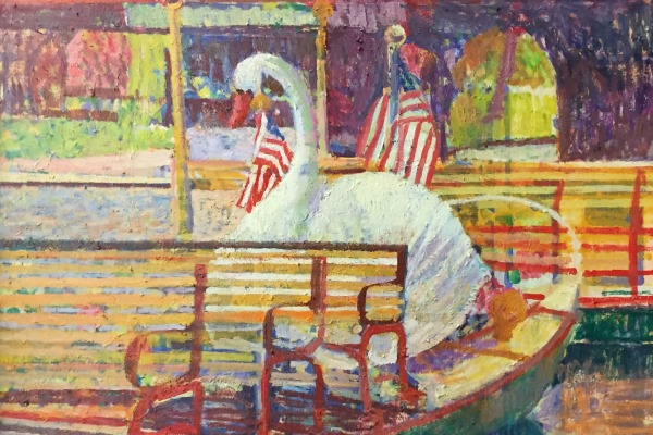
Impressionist painter Sam Barber took his children to ride the swan boats in Boston Public Garden when they were small. But he’s often returned to them as a source of inspiration. “Every time I get desperate I go to Boston and photograph the swans and buy art supplies at Johnson Paint on Newbury Street,” he says.
Sam estimates he’s painted the swan boats some two dozen times over the past 35 to 40 years. A 48 x 48-inch version donated to Children’s Hospital hangs in their lobby, providing a cheerful sight for young patients and their families. The swan boat on view at Chapman Art Gallery is one of his most recent. What particularly captivated him was the way the wind disturbed the reflection on the water, he says. He painted it loosely and freely, almost as if it were an abstraction. The reflection, however, looks very fluid and convincing when viewed from a short distance. The entire painting shimmers with color and light.
Sam has found the swan boats compelling in different seasons, including in winter, covered with snow; under different light conditions, with sunsets being a favorite; and from different viewpoints. Sometimes he’s looked down on the boats from the bridge over the lagoon. Some paintings — like this one — focus on a single boat. Others have shown the boats in various configurations. “I never repeat a painting,” Sam says.
“Why do I like the swan boats?” he asks, then answers. “Because the swan is like the queen of the birds. … She knows she’s beautiful.” The “swan” in this painting is beautifully painted as well, with exquisite pale shades of lavender, peach, blue and green making up her graceful white form. “How good the painting is is how much love you give to it,” Sam says. See more paintings by Sam Barber
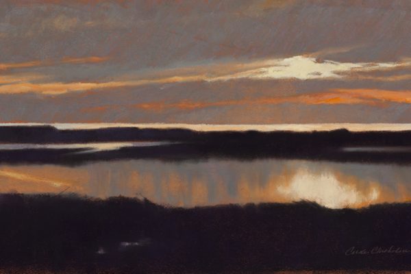
Drivers between Osterville and Centerville often slow down when crossing the Main Street/South Main Street bridge between the two villages. Looking south there’s the Centerville River and Long Beach with Centerville Harbor beyond. Looking north, Bumps River winds its way through marshland. The beauty can be distracting, and Osterville artist Carole Garvey often does more than slow down. She’ll park her car at a friend’s nearby house and walk back to the bridge to make “notes” on the view with her pastel pencils, sketchpad and camera. Just recently, she says, she commented to her husband, “I wonder how many times I’ve painted it?” Something like 15 to 20 times over the years, she guesses.
But the attraction isn’t the particular place per se. Carole isn’t especially concerned with her landscapes being recognizable, but with communicating the transient effects of color and light. The views from the bridge are “always changing; it’s a new show every day, depending on the season, weather and time of day,” Carole says. “I don’t think, ‘Oh, here I am, back at the Centerville River.’ But it’s a source of inspiration.”
A signature artist with the Pastel Society of America and the Pastel Painters Society of Cape Cod, Carole treasures pastels for their immediacy and enduring purity of color. “River Sunset” was inspired by her experience of the view one late fall afternoon, looking south toward Centerville River. Her luminous scene — with the pale yellow sun caught in the clouds, mirrored forever in the tranquil water — makes us slow down, too, wanting to take that longer look. See More Pastel Paintings by Carole Chisholm Garvey

Though some boaters may have less flattering names for them, the five birds in Jill Bates’ “A Day at the Beach” are double-crested cormorants. “It’s the bird everyone hates because they poop on the boats,” the artist says. “It’s a sad thing that they’re so not liked — they’re so beautiful and very social. They’re so graceful in the water and when they dive. I love to see them sitting on the back end of someone’s dory, eating a fish or whatever.”
Jill, who lives in Cotuit, enjoys watching cormorants swimming or sitting on rafts off Sampson’s Island or in Osterville’s North Bay: They’re very prevalent in the area. But she chose a beach as the setting for this painting in order to accentuate their slender bodies and, especially, the exquisite interplay of their sinuous black necks against a simple background. She also hoped to humanize the bird a bit — to make it more sympathetic — by playing up its social nature. “It was really fun to capture a feeling of camaraderie and some kind of expression,” she says. “We do try to impose these human qualities on animals.” See more of Jill Bates’ unique point of view

|